3 Week 3: Drawing a boxplot
- You’ll learn how to draw basic boxplots, which are useful for comparing groups on a numeric variable.
- You’ll tinker with the appearence of your graphs.
- You’ll learn how to compute basic summaries such as group means.
3.1 Reading in data
- Download the file
VowelChoices_ij.csvfrom Moodle to thedatasubdirectory of your R project directory. This file contains a part of the results of a learning experiment (Vanhove 2016) in which 80 participants were assigned to one of two learning conditions (LearningCondition). The columnPropCorrectcontains the proportion of correct answers for each participant, and the question we want to answer concerns the difference in the performance between learners in the different conditions. - Open your R project.
- Create a new script and copy the commands with which you loaded the packages and imported the dataset from last week’s script to this new script.
- Adapt the command for importing the data so that it’ll read in the file
VowelChoices_ij.csvand that the dataset will be known in R asd_box. Execute these commands.
From now on, I’ll assume that you won’t enter commands directly to the R console but that you’ll first enter them into a script which you’ll then execute (= much more efficient and manageable).
Tip: Comment your code (with #). This way you’ll be able to understand what your code accomplishes in a few months’ time, which will make it easier to recycle your scripts. You don’t have to copy my comments verbatim. “Your closest collaborator is you six months ago but you don’t reply to email.”
- Inspect the dataset in R to check that it contains 80 rows and 3 labelled columns (
Subject,LearningCondition,PropCorrect).
3.2 What are boxplots?
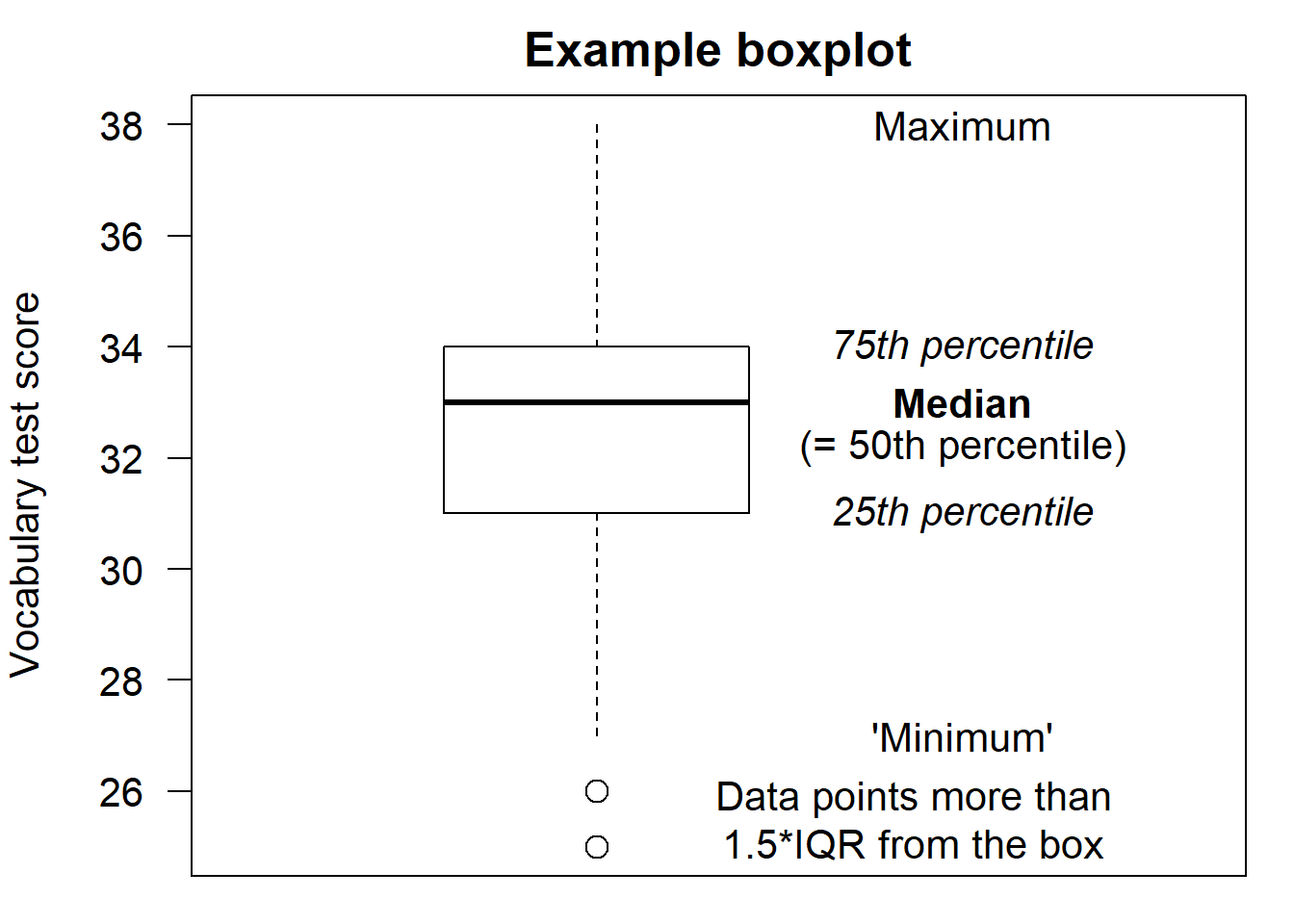
Below you see a basic boxplot of the vocabulary test scores of the eighty participants in (Vanhove 2016). The median score is highlighted by a thick line. The 25th and 75th percentiles are highlighted by thinner lines and together form a box. The difference between the 75th and 25th percentile is called the inter-quartile range (IQR). The data points that don’t fall in the box, that is, the data points that don’t make up the middle 50% of the data, are represented by a line protruding from the upper part of the box and by a line protruding from the lower part of the box. However, data points whose distance to the box exceeds 1.5 times the inter-quartile range are plotted separately. If such data points exist, the lines protruding from the box only extend up to the lowest / highest data point whose distance to the box is lower than 1.5 times the IQR.
From the boxplot below, we can glean that the IQR is \(34 - 31 = 3\). The highest data point has a value of 38. Since \(38 < 34 + 1.5 \times 3 = 38.5\), this data point is captured by the line protruding from the upper part of the box. The lowest data point has a value of 25. Since \(25 < 31 - 1.5 \times 3 = 26.5\), it lies too far from the box to be captured by the line protruding from the lower part of the box, so it gets drawn separately.
3.3 Drawing boxplots
We can draw boxplots in order to compare the distribution of a variable in two groups. But you can also use boxplots to compare more than two groups. Next week we’ll add the individual data points to these boxplots which can make them more informative still.
From now on, I’ll always assume that you’ve loaded the tidyverse and here packages.
- The following command plots the accuracy
data (
PropCorrect) using a separate boxplot for each condition (LearningCondition). You already know how the first three lines work; the fourth specifies that the data should be plotted using boxplots.
# Boxplot PropCorrect vs. LearningCondition
ggplot(data = d_box,
       aes(x = LearningCondition,
           y = PropCorrect)) +
  geom_boxplot()                  # summarise data with boxplots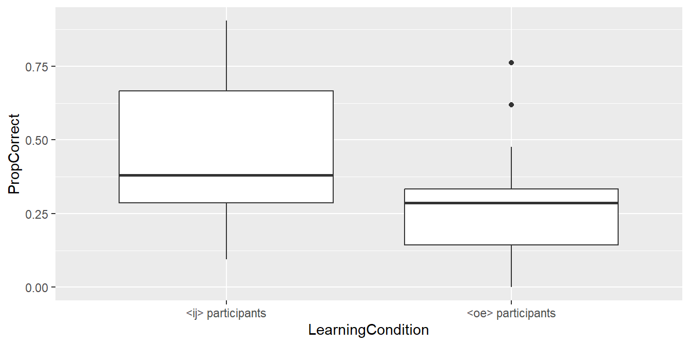
- Label the x-axis as “Learning condition” and the y-axis as “Proportion correct answers”. I don’t provide the commands for doing so; you already know them from last week.
3.4 Adjusting the appearance of plots
- By default,
ggplot2(the part of thetidyversethat takes care of plotting) produces plots with a grey background (which doesn’t seem to please anyone save for its developer). This can be changed by appending the commandtheme_bw()(black and white) to theggplotcall:
ggplot(data = d_box,
       aes(x = LearningCondition,
           y = PropCorrect)) +
  geom_boxplot() +
  xlab("Learning condition") +
  ylab("Proportion correct answers") +
  theme_bw()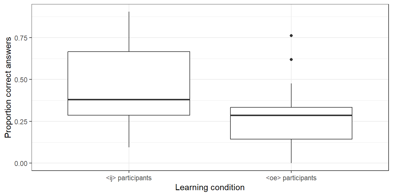
For other options, see https://ggplot2.tidyverse.org/reference/ggtheme.html.
- To change the font size, insert a number between the brackets of the
theme_bw()command. Finding a suitable font size is a matter of trial and error.
ggplot(data = d_box,
       aes(x = LearningCondition,
           y = PropCorrect)) +
  geom_boxplot() +
  xlab("Learning condition") +
  ylab("Proportion correct answers") +
  theme_bw(15)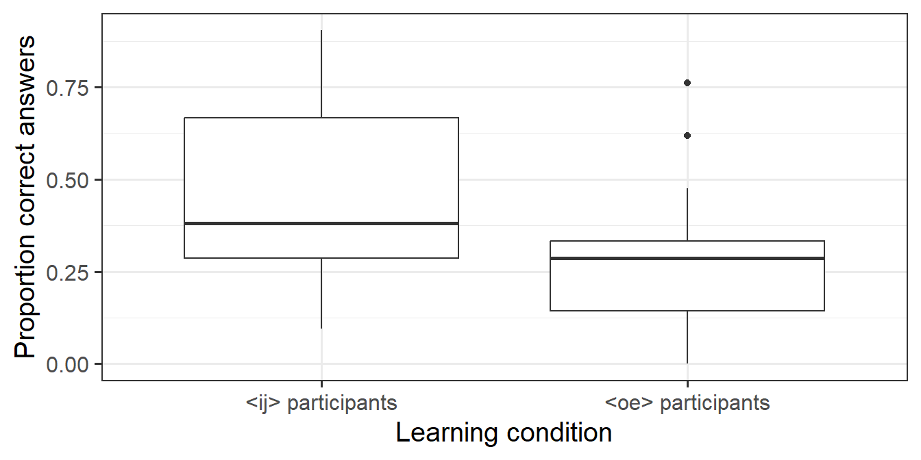
- When you’re happy with a plot, you can save it using
ggsave(). You can set the width and height of the figure using thewidthandheightparameters, e.g.,
Per default, the width and height numbers are in inches. See the help page (https://ggplot2.tidyverse.org/reference/ggsave.html) on how to override this.
3.5 Computing summaries
While this is a tutorial on drawing graphs, it’s useful at this stage
to know how to obtain some basic information about the datasets you’re
working with. There are many ways to accomplish most things in R,
and computing summaries is no exception. The alternative shown here is similar
to the way plots are constructed in ggplot2, so hopefully it’s easy to
pick up.
First, let’s compute the number of observations in the d_box dataset
as well as the mean of the PropCorrect variable. The code below can
be read as follows:
Take
d_box, THEN
summarise it as follows: compute the number of observations (
n()) and store it asnumber
and compute the mean of
PropCorrectand store it asmean_PropCorrect.
## # A tibble: 1 × 2
##   number mean_PropCorrect
##    <int>            <dbl>
## 1     80            0.368
Thus we see that there are 80 observations in the dataset with a mean PropCorrect of about 0.37.
If we want to compute the mean for the two learning conditions separately,
we insert a corresponding group_by() statement. The code below can thus be read
as
Take
d_box, THEN
Group it by the values of
LearningCondition, THEN
For each group created, create a summary containing the mean of the
PropCorrectvariable.
## # A tibble: 2 × 2
##   LearningCondition mean_PropCorrect
##   <chr>                        <dbl>
## 1 <ij> participants            0.436
## 2 <oe> participants            0.290
The word THEN is represented by a so-called pipe operator (|>), a shortcut for which is ctrl+shift+m on Windows/Linux and cmd + shift + m on Mac.
3.6 Exercise
The file Vanhove2014_CognateProfile.csv contains data from Vanhove (2014).
163 Swiss-Germans attempted to translate 45 written Swedish words, all of which
had German, English and/or French cognates.
To check which participants already had some minimal knowledge of Swedish,
they also had to translate five words without cognates in German, English or French
(e.g., älska ‘to love’); these are known as ‘profile words’.
For the subsequent analysis, it was important to know
(a) how many participants could translate at least one such profile word correctly; and
(b) if participants who could translate at least one such profile word did better at translating cognates than those who couldn’t.
The column CorrectCognates contains the number of correct cognate
translations per participant; the column shows whether the participant
in question was able to translate at least one profile word correctly (yes vs. no).
- In a new script, read in the dataset into R.
- Compute the number of participants who were able to correctly translate at least one profile word.
- Use a boxplot to compare the number of correctly translated cognate words between participants that could translate at least one profile word correctly and those that couldn’t. Label your axes appropriately.
- Compile the HTML report.
- Submit both the boxplot and the HTML report.