I blog about statistics and research design with an audience consisting of researchers in bilingualism, multilingualism, and applied linguistics in mind.
Latest blog posts
Exact significance tests for 2 × 2 tables
R
significance
Two-by-two contingency tables look so simple that you’d be forgiven for thinking they’re straightforward to analyse. A glance at the statistical literature on the analysis of contingency tables, however, reveals a plethora of techniques and controversies surrounding them that will quickly disabuse you of this notion (see, for instance, Fagerland et al. 2017). In this blog post, I discuss a handful of different study designs that give rise to two-by-two tables and present a few exact significance tests that can be applied to these tables. A more exhaustive overview can be found in Fagerland et al. (2017).
Adjusting to Julia: Piecewise regression
Julia
piecewise regression
non-linearities
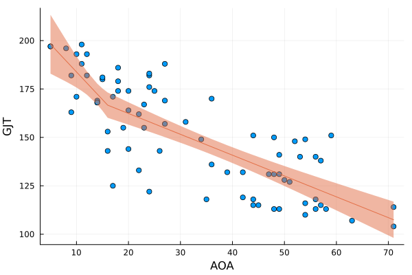
In this fourth installment of Adjusting to Julia, I will at long last analyse some actual data. One of the first posts on this blog was Calibrating p-values in ‘flexible’ piecewise regression models. In that post, I fitted a piecewise regression to a dataset comprising the ages at which a number of language learners started learning a second language (age of acquisition, AOA) and their scores on a grammaticality judgement task (GJT) in that second language. A piecewise regression is a regression model in which the slope of the function relating the predictor (here: AOA) to the outcome (here: GJT) changes at some value of the predictor, the so-called breakpoint. The problem, however, was that I didn’t specify the breakpoint beforehand but pick the breakpoint that minimised the model’s deviance. This increased the probability that I would find that the slope before and after the breakpoint differed, even if they in fact were the same. In the blog post I wrote almost nine years ago, I sought to recalibrate the p-value for the change in slope by running a bunch of simulations in R. In this blog post, I’ll do the same, but in Julia.
Adjusting to Julia: Generating the Fibonacci sequence
Julia
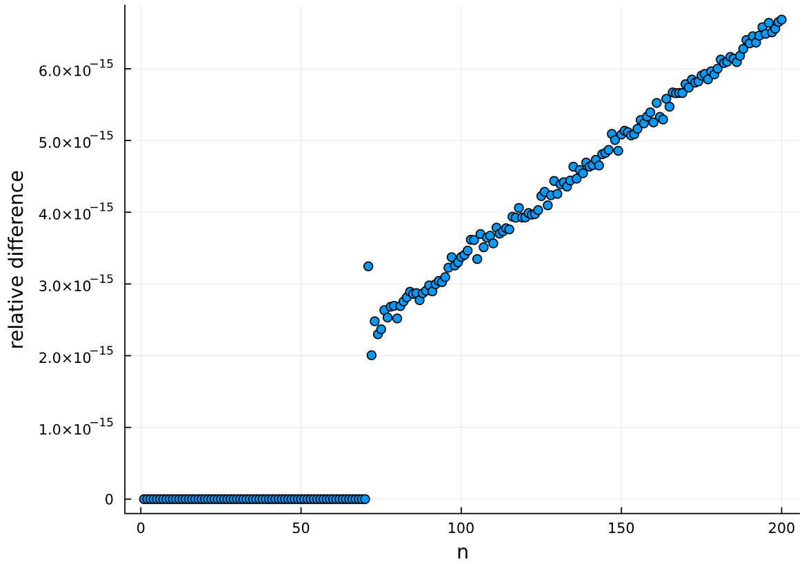
I’m currently learning a bit of Julia and I thought I’d share with you a couple of my attempts at writing Julia code. I’ll spare you the sales pitch, and I’ll skip straight to the goal of this blog post: writing three different Julia functions that can generate the Fibonacci sequence.
In research, don’t do things you don’t see the point of
simplicity
silly tests
research questions
When I started reading quantitative research reports, I hadn’t taken any methods or statistics classes, so small wonder that I didn’t understand why certain background variables on the participants were collected, why it was reported how many of them were women and how many of them were men, and what all those numbers in the results sections meant. However, I was willing to assume that these reports had been written by some fairly intelligent people and that, by the Gricean maxim of relevance, these bits and bobs must be relevant — why else report them?
An R function for computing Levenshtein distances between texts using the word as the unit of comparison
R
For a new research project, we needed a way to tabulate the changes that were made to a text when correcting it. Since we couldn’t find a suitable tool, I wrote an R function that uses the Levenshtein algorithm to determine both the smallest number of words that need to be changed to transform one version of a text into another and what these changes are.
The consequences of controlling for a post-treatment variable
R
multiple regression
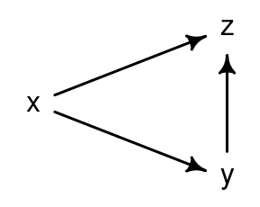
Let’s say you want to find out if a pedagogical intervention boosts learners’ conversational skills in L2 French. You’ve learnt that including a well-chosen control variable in your analysis can work wonders in terms of statistical power and precision, so you decide to administer a French vocabulary test to your participants in order to include their score on this test in your analyses as a covariate. But if you administer the vocabulary test after the intervention, it’s possible that the vocabulary scores are themselves affected by the intervention as well. If this is indeed the case, you may end up doing more harm than good. In this blog post, I will take a closer look at five general cases where controlling for such a ‘post-treatment’ variable is harmful.
Capitalising on covariates in cluster-randomised experiments
R
power
significance
design features
cluster-randomised experiments
preprint
In cluster-randomised experiments, participants are assigned to the conditions randomly but not on an individual basis. Instead, entire batches (‘clusters’) of participants are assigned in such a way that each participant in the same cluster is assigned to the same condition. A typical example would be an educational experiment in which all pupils in the same class get assigned to the same experimental condition. Crucially, the analysis should take into account the fact that the random assignment took place at the cluster level rather than at the individual level.
Tutorial: Visualising statistical uncertainty using model-based graphs
R
graphs
logistic regression
mixed-effects models
multiple regression
Bayesian statistics
brms
I wrote a tutorial about visualising the statistical uncertainty in statistical models for a conference that took place a couple of months ago, and I’ve just realised that I’ve never advertised this tutorial in this blog. You can find the tutorial here: Visualising statistical uncertainty using model-based graphs.
Interpreting regression models: a reading list
measurement error
logistic regression
correlational studies
mixed-effects models
multiple regression
predictive modelling
research questions
contrast coding
reliability
Last semester I taught a class for PhD students and collaborators that focused on how the output of regression models is to be interpreted. Most participants had at least some experience with fitting regression models, but I had noticed that they were often unsure about the precise statistical interpretation of the output of these models (e.g., What does this parameter estimate of 1.2 correspond to in the data?). Moreover, they were usually a bit too eager to move from the model output to a subject-matter interpretation (e.g., What does this parameter estimate of 1.2 tell me about language learning?). I suspect that the same goes for many applied linguists, and social scientists more generally, so below I provide an overview of the course contents as well as the reading list.
Tutorial: Obtaining directly interpretable regression coefficients by recoding categorical predictors
R
contrast coding
mixed-effects models
multiple regression
tutorial
research questions
The output of regression models is often difficult to parse, especially when categorical predictors and interactions between them are being modelled. The goal of this tutorial is to show you how you can obtain estimated coefficients that you can interpret directly in terms of your research question. I’ve learnt about this technique thanks to Schad et al. (2020), and I refer to them for a more detailed discussion. What I will do is go through three examples of increasing complexity that should enable you to apply the technique in your own analyses.
Nonparametric tests aren’t a silver bullet when parametric assumptions are violated
R
power
significance
simplicity
assumptions
nonparametric tests
Some researchers adhere to a simple strategy when comparing data from two or more groups: when they think that the data in the groups are normally distributed, they run a parametric test (\(t\)-test or ANOVA); when they suspect that the data are not normally distributed, they run a nonparametric test (e.g., Mann–Whitney or Kruskal–Wallis). Rather than follow such an automated approach to analysing data, I think researchers ought to consider the following points:
Baby steps in Bayes: Incorporating reliability estimates in regression models
R
Stan
Bayesian statistics
measurement error
correlational studies
reliability
Researchers sometimes calculate reliability indices such as Cronbach’s \(\alpha\) or Revelle’s \(\omega_T\), but their statistical models rarely take these reliability indices into account. Here I want to show you how you can incorporate information about the reliability about your measurements in a statistical model so as to obtain more honest and more readily interpretable parameter estimates.
Baby steps in Bayes: Accounting for measurement error on a control variable
R
Stan
Bayesian statistics
measurement error
correlational studies
In observational studies, it is customary to account for confounding variables by including measurements of them in the statistical model. This practice is referred to as statistically controlling for the confounding variables. An underappreciated problem is that if the confounding variables were measured imperfectly, then statistical control will be imperfect as well, and the confound won’t be eradicated entirely (see Berthele & Vanhove 2017; Brunner & Austin 2009; Westfall & Yarkoni 2016) (see also Controlling for confounding variables in correlational research: Four caveats).
Five suggestions for simplifying research reports
simplicity
silly tests
graphs
cluster-randomised experiments
open science
Whenever I’m looking for empirical research articles to discuss in my classes on second language acquisition, I’m struck by how needlessly complicated and unnecessarily long most articles in the field are. Here are some suggestions for reducing the numerical fluff in quantitative research reports.
Adjusting for a covariate in cluster-randomised experiments
R
power
significance
simplicity
mixed-effects models
cluster-randomised experiments
Cluster-randomised experiments are experiments in which groups of participants (e.g., classes) are assigned randomly but in their entirety to the experiments’ conditions. Crucially, the fact that entire groups of participants were randomly assigned to conditions - rather than each participant individually - should be taken into account in the analysis, as outlined in a previous blog post. In this blog post, I use simulations to explore the strengths and weaknesses of different ways of analysing cluster-randomised experiments when a covariate (e.g., a pretest score) is available.
Drawing scatterplot matrices
R
graphs
correlational studies
non-linearities
multiple regression
This is just a quick blog post to share a function with which you can draw scatterplot matrices.
Collinearity isn’t a disease that needs curing
R
multiple regression
assumptions
collinearity
Every now and again, some worried student or collaborator asks me whether they’re “allowed” to fit a regression model in which some of the predictors are fairly strongly correlated with one another. Happily, most Swiss cantons have a laissez-faire policy with regard to fitting models with correlated predictors, so the answer to this question is “yes”. Such an answer doesn’t always set the student or collaborator at ease, so below you find my more elaborate answer.
Interactions in logistic regression models
R
logistic regression
tutorial
bootstrapping
Bayesian statistics
brms
When you want to know if the difference between two conditions is larger in one group than in another, you’re interested in the interaction between ‘condition’ and ‘group’. Fitting interactions statistically is one thing, and I will assume in the following that you know how to do this. Interpreting statistical interactions, however, is another pair of shoes. In this post, I discuss why this is the case and how it pertains to interactions fitted in logistic regression models.
Before worrying about model assumptions, think about model relevance
simplicity
graphs
non-linearities
assumptions
Beginning analysts tend to be overly anxious about the assumptions of their statistical models. This observation is the point of departure of my tutorial Checking the assumptions of your statistical model without getting paranoid, but it’s probably too general. It’d be more accurate to say that beginning analysts who e-mail me about possible assumption violations and who read tutorials on statistics are overly anxious about model assumptions. (Of course, there are beginning as well as seasoned researchers who are hardly ever worry about model assumptions, but they’re unlikely to read papers and blog posts about model assumptions.)
Guarantees in the long run vs. interpreting the data at hand: Two analyses of clustered data
R
mixed-effects models
cluster-randomised experiments
An analytical procedure may have excellent long-run properties but still produce nonsensical results in individual cases. I recently encountered a real-life illustration of this, but since those data aren’t mine, I’ll use simulated data with similar characteristics for this blog post.
Baby steps in Bayes: Recoding predictors and homing in on specific comparisons
Bayesian statistics
brms
R
graphs
mixed-effects models
contrast coding
Interpreting models that take into account a host of possible interactions between predictor variables can be a pain, especially when some of the predictors contain more than two levels. In this post, I show how I went about fitting and then making sense of a multilevel model containing a three-way interaction between its categorical fixed-effect predictors. To this end, I used the
brms
package, which makes it relatively easy to fit Bayesian models using a notation that hardly differs from the one used in the popular lme4
package. I won’t discuss the Bayesian bit much here (I don’t think it’s too important), and I will instead cover the following points:
A closer look at a classic study (Bailey et al. 1974)
graphs
In this blog post, I take a closer look at the results of a classic study I sometimes discuss in my classes on second language acquisition. As I’ll show below, the strength of this study’s findings is strongly overexaggerated, presumably owing to a mechanical error.
Looking for comments on a paper on model assumptions
R
graphs
tutorial
preprint
assumptions
cannonball
I’ve written a paper titled Checking the assumptions of your statistical model without getting paranoid and I’d like to solicit your feedback. The paper is geared towards beginning analysts, so I’m particularly interested in hearing from readers who don’t consider themselves expert statisticians if there is anything that isn’t entirely clear to them. If you’re a more experienced analyst and you spot an error in the paper or accompanying tutorial, I’d be grateful if you could let me know, too, of course.
Baby steps in Bayes: Piecewise regression with two breakpoints
R
piecewise regression
non-linearities
Bayesian statistics
Stan
In this follow-up to the blog post Baby steps in Bayes: Piecewise regression, I’m going to try to model the relationship between two continuous variables using a piecewise regression with not one but two breakpoints. (The rights to the movie about the first installment are still up for grabs, incidentally.)
A data entry form with failsafes
data entry
I’m currently working on a large longitudinal project as a programmer/analyst. Most of the data are collected using paper/pencil tasks and questionnaires and need to be entered into the database by student assistants. In previous projects, this led to some minor irritations since some assistants occasionally entered some words with capitalisation and others without, or they inadvertently added a trailing space to the entry, or used participant IDs that didn’t exist – all small things that cause difficulties during the analysis.
Baby steps in Bayes: Piecewise regression
R
Stan
piecewise regression
non-linearities
Bayesian statistics
Inspired by Richard McElreath’s excellent book Statistical rethinking: A Bayesian course with examples in R and Stan, I’ve started dabbling in Bayesian statistics. In essence, Bayesian statistics is an approach to statistical inference in which the analyst specifies a generative model for the data (i.e., an equation that describes the factors they suspect gave rise to the data) as well as (possibly vague) relevant information or beliefs that are external to the data proper. This information or these beliefs are then adjusted in light of the data observed.
A brief comment on research questions
research questions
All too often, empirical studies in applied linguistics are run in order to garner evidence for a preordained conclusion. In such studies, the true, perhaps unstated, research question is more of a stated aim than a question: “With this study, we want to show that [our theoretical point of view is valuable; this teaching method of ours works pretty well; multilingual kids are incredibly creative; etc.].” The problem with aims such as these is that they take the bit between square brackets for granted, i.e., that the theoretical point of view is indeed valuable; that our teaching method really does work pretty well; or that multilingual kids indeed are incredibly creative – the challenge is merely to convince readers of these assumed facts by demonstrating them empirically. I think that such a mentality leads researchers to disregard evidence contradicting their assumption or explain it away as an artifact of a method that, in hindsight, wasn’t optimal.
Checking model assumptions without getting paranoid
assumptions
R
tutorial
graphs
Statistical models come with a set of assumptions, and violations of these assumptions can render irrelevant or even invalid the inferences drawn from these models. It is important, then, to verify that your model’s assumptions are at least approximately tenable for your data. To this end, statisticians commonly recommend that you check the distribution of your model’s residuals (i.e., the difference between your actual data and the model’s fitted values) graphically. An excellent piece of advice that, unfortunately, causes some students to become paranoid and see violated assumptions everywhere they look. This blog post is for them.
Consider generalisability
design features
mixed-effects models
A good question to ask yourself when designing a study is, “Who and what are any results likely to generalise to?” Generalisability needn’t always be a priority when planning a study. But by giving the matter some thought before collecting your data, you may still be able to alter your design so that you don’t have to smother your conclusions with ifs and buts if you do want to draw generalisations.
Increasing power and precision using covariates
power
design features
generalised additive models
non-linearities
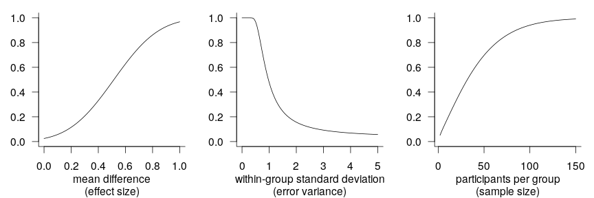
A recurring theme in the writings of methodologists over the last years and indeed decades is that researchers need to increase the statistical power (and precision) of the studies they conduct. These writers have rightly stressed the necessity of larger sample sizes, but other research design characteristics that affect power and precision have received comparatively little attention. In this blog post, I discuss and demonstrate how by capitalising on information that they collect anyway, researchers can achieve more power and precision without running more participants.
Suggestions for more informative replication studies
design features
mixed-effects models
In recent years, psychologists have started to run large-scale replications of seminal studies. For a variety of reasons, which I won’t go into, this welcome development hasn’t quite made it to research on language learning and bi- and multilingualism. That said, I think it can be interesting to scrutinise how these large-scale replications are conducted. In this blog post, I take a closer look at a replication attempt by O’Donnell et al. with some 4,500 participants that’s currently in press at Psychological Science and make five suggestions as to how I think similar replications could be designed to be even more informative.
Confidence interval-based optional stopping
R
design features
significance
Stopping to collect data early when the provisional results are significant (“optional stopping”) inflates your chances of finding a pattern in the data when nothing is going on. This can be countered using a technique known as sequential testing, but that’s not what this post is about. Instead, I’d like to illustrate that optional stopping isn’t necessarily a problem if your stopping rule doesn’t involve p-values. If instead of on p-values, you base your decision to collect more data or not on how wide your current confidence interval (or Bayesian credible interval) is, peeking at your data can be a reasonable strategy. Additionally, in this post, I want share some code for
R
functions that you can adapt in order to simulate the effects of different stopping rules.
Abandoning standardised effect sizes and opening up other roads to power
power
effect sizes
measurement error
design features
R
Numerical summaries of research findings will typically feature an indication of the sizes of the effects that were studied. These indications are often standardised effect sizes, which means that they are expressed relative to the variance in the data rather than with respect to the units in which the variables were measured. Popular standardised effect sizes include Cohen’s d, which expresses the mean difference between two groups as a proportion of the pooled standard deviation, and Pearson’s r, which expresses the difference in one variable as a proportion of its standard deviation that is associated with a change of one standard deviation of another variable. There exists a rich literature that discusses which standardised effect sizes ought to be used depending on the study’s design, how this or that standardised effect size should be adjusted for this and that bias, and how confidence intervals should be constructed around standardised effect sizes (blog post Confidence intervals for standardised mean differences). But most of this literature should be little importance to the practising scientist for the simple reason that standardised effect sizes themselves ought to be of little importance.
Fitting interactions between continuous variables
R
graphs
generalised additive models
non-linearities
Splitting up continuous variables is generally a bad idea. In terms of statistical efficiency, the popular practice of dichotomising continuous variables at their median is comparable to throwing out a third of the dataset. Moreover, statistical models based on split-up continuous variables are prone to misinterpretation: threshold effects are easily read into the results when, in fact, none exist. Splitting up, or ‘binning’, continuous variables, then, is something to avoid. But what if you’re interested in how the effect of one continuous predictor varies according to the value of another continuous predictor? In other words, what if you’re interested in the interaction between two continuous predictors? Binning one of the predictors seems appealing since it makes the model easier to interpret. However, as I’ll show in this blog post, it’s fairly straightforward to fit and interpret interactions between continuous predictors.
Tutorial: Adding confidence bands to effect displays
R
graphs
logistic regression
mixed-effects models
multiple regression
tutorial
In the previous blog post, I demonstrated how you can draw effect displays to render regression models more intelligible to yourself and to your audience. These effect displays did not contain information about the uncertainty inherent to estimating regression models, however. To that end, this blog post demonstrates how you can add confidence bands to effect displays for multiple regression, logistic regression, and logistic mixed-effects models, and explains how these confidence bands are constructed.
Tutorial: Plotting regression models
R
graphs
logistic regression
mixed-effects models
multiple regression
tutorial
The results of regression models, particularly fairly complex ones, can be difficult to appreciate and hard to communicate to an audience. One useful technique is to plot the effect of each predictor variable on the outcome while holding constant any other predictor variables. Fox (2003) discusses how such effect displays are constructed and provides an implementation in the
effects
package for R
.
Confidence intervals for standardised mean differences
R
effect sizes
Standardised effect sizes express patterns found in the data in terms of the variability found in the data. For instance, a mean difference in body height could be expressed in the metric in which the data were measured (e.g., a difference of 4 centimetres) or relative to the variation in the data (e.g., a difference of 0.9 standard deviations). The latter is a standardised effect size known as Cohen’s d.
Which predictor is most important? Predictive utility vs. construct importance
effect sizes
correlational studies
measurement error
Every so often, I’m asked for my two cents on a correlational study in which the researcher wants to find out which of a set of predictor variables is the most important one. For instance, they may have the results of an intelligence test, of a working memory task and of a questionnaire probing their participants’ motivation for learning French, and they want to find out which of these three is the most important factor in acquiring a nativelike French accent, as measured using a pronunciation task. As I will explain below, research questions such as these can be interpreted in two ways, and whether they can be answered sensibly depends on the interpretation intended.
A few examples of bootstrapping
bootstrapping
R
This post illustrates a statistical technique that becomes particularly useful when you want to calculate the sampling variation of some custom statistic when you start to dabble in mixed-effects models. This technique is called bootstrapping and I will first illustrate its use in constructing confidence intervals around a custom summary statistic. Then I’ll illustrate three bootstrapping approaches when constructing confidence intervals around a regression coefficient, and finally, I will show how bootstrapping can be used to compute p-values.
What data patterns can lie behind a correlation coefficient?
effect sizes
graphs
correlational studies
non-linearities
R
In this post, I want to, first, help you to improve your intuition of what data patterns correlation coefficients can represent and, second, hammer home the point that to sensibly interpret a correlation coefficient, you need the corresponding scatterplot.
The Centre for Open Science’s Preregistration Challenge: Why it’s relevant and some recommended background reading
significance
multiple comparisons
organisation
open science
This blog post is an edited version of a mail I sent round to my colleagues at the various language and linguistics departments in Fribourg. Nothing in this post is new per se, but I haven’t seen much discussion of these issues among linguists, applied linguists and bilingualism researchers.
R tip: Ordering factor levels more easily
R
graphics
By default,
R
sorts the levels of a factor alphabetically. When drawing graphs, this results in ‘Alabama First’ graphs, and it’s usually better to sort the elements of a graph by more meaningful principles than alphabetical order. This post illustrates three convenience functions you can use to sort factor levels in R
according to another covariate, their frequency of occurrence, or manually.
Classifying second-language learners as native- or non-nativelike: Don’t neglect classification error rates
R
machine learning
random forests
I’d promised to write another installment on drawing graphs, but instead I’m going to write about something that I had to exclude, for reasons of space, from a recently published book chapter on age effects in second language (L2) acquisition: classifying observations (e.g., L2 learners) and estimating error rates.
Tutorial: Drawing a line chart
R
graphs
tutorial
Graphs are incredibly useful both for understanding your own data and for communicating your insights to your audience. This is why the next few blog posts will consist of tutorials on how to draw four kinds of graphs that I find most useful: scatterplots, line charts, boxplots and some variations, and Cleveland dotplots. These tutorials are aimed primarily at the students in our MA programme. Today’s graph: the line chart.
Tutorial: Drawing a scatterplot
R
graphs
tutorial
Graphs are incredibly useful both for understanding your own data and for communicating your insights to your audience. This is why the next few blog posts will consist of tutorials on how to draw four kinds of graphs that I find most useful: scatterplots, linecharts, boxplots and some variations, and Cleveland dotplots. These tutorials are aimed primarily at the students in our MA programme. Today’s graph: the scatterplot.
Surviving the ANOVA onslaught
simplicity
At a workshop last week, we were asked to bring along examples of good and bad academic writing. Several of the bad examples were papers where the number of significance tests was so large that the workshop participants felt that they couldn’t make sense of the Results section. It’s not that they didn’t understand each test separately but rather that they couldn’t see the forest for the trees. I, too, wish researchers would stop inundating their readers with t, F and p-values (especially in the running text), but until such time readers need to learn how to survive the ANOVA onslaught. Below I present a list of guidelines to help them with that.
Why reported R² values are often too high
effect sizes
multiple comparisons
multiple regression
R
After reading a couple of papers whose conclusions were heavily based on R² (“variance explained”) values, I thought I’d summarise why I’m often skeptical of such conclusions. The reason, in a nutshell, is that reported R² values tend to overestimate how much of the variance in the outcome variable the model can actually “explain”. To dyed-in-the-wool quantitative researchers, none of this blog post will be new, but I hope that it will make some readers think twice before focusing heavily on R² values.
On correcting for multiple comparisons: Five scenarios
significance
power
multiple comparisons
Daniël Lakens recently blogged about a topic that crops up every now and then: Do you need to correct your p-values when you’ve run several significance tests? The blog post is worth a read, and I feel this quote sums it up well:
Silly significance tests: The main effects no one is interested in
simplicity
silly tests
We are often more interested in interaction effects than in main effects. In a given study, we may not so much be interested in whether high-proficiency second-language (L2) learners react more quickly to target-language stimuli than low-proficiency L2 learners nor in whether L2 learners react more quickly to L1–L2 cognates than to non-cognates. Rather, what we may be interested in is whether the latency difference on cognates and non-cognates differs between high- and low-proficiency learners. When running an ANOVA of the two-way interaction, we should include the main effects, too, and our software package will dutifully report the F-tests for these main effects (i.e., for proficiency and cognacy).
Experiments with intact groups: spurious significance with improperly weighted t-tests
significance
design features
cluster-randomised experiments
R
When analysing experiments in which intact groups (clusters) were assigned to the experimental conditions, t-tests on cluster means that weight these means for cluster size are occasionally used. In fact, I too endorsed this approach as a straightforward and easily implemented way to account for clustering. It seems, however, that these weighted t-test are still anti-conservative, i.e. they find too many significant differences when there is in fact no effect. In this post, I present simulation results to illustrate this and I also correct another published error of mine.
Some advantages of sharing your data and code
open science
I believe researchers should put their datasets and any computer code used to analyse them online as a matter of principle, without being asked to, and many researchers (Dorothy Bishop, Rolf Zwaan, Jelte Wicherts, and certainly dozens more) have cogently argued that such ‘open data’ should be the norm. However, it seems to me that some aren’t too enthused at the prospect of putting their data and code online as they fear that some curmudgeon will go over them with the fine-toothed comb to find some tiny error and call the whole study into question. Why else would anyone be interested in their data and code?
Drawing a scatterplot with a non-linear trend line
graphs
non-linearities
R
This blog post is a step-by-step guide to drawing scatterplots with non-linear trend lines in R. It is geared towards readers who don’t have much experience with drawing statistical graphics and who aren’t entirely happy with their attempts in Excel.
The problem with cutting up continuous variables and what to do when things aren’t linear
power
generalised additive models
non-linearities
R
A common analytical technique is to cut up continuous variables (e.g. age, word frequency, L2 proficiency) into discrete categories and then use them as predictors in a group comparison (e.g. ANOVA). For instance, stimuli used in a lexical decision task are split up into a high-frequency and a low-frequency group, whereas the participants are split up into a young, middle, and old group. Although discretising continuous variables appears to make the analysis easier, this practice has been criticised for years. Below I outline the problems with this approach and present some alternatives.
Analysing experiments with intact groups: the problem and an easy solution
significance
power
design features
cluster-randomised experiments
R
To evaluate a new teaching method, a researcher arranges for one class of 20 students to be taught with the old method and another class of 20 students with the new method. According to a t-test, the students taught with the new method significantly outperform the control group at an end-of-year evaluation. The set-up of studies like these is pretty standard in applied linguistics – but it is fatally flawed. In this post, I explain the problem with comparing intact groups using traditional statistical tools and present a solution that’s easy to both understand and implement.
Covariate adjustment in logistic mixed models: Is it worth the effort?
power
effect sizes
logistic regression
mixed-effects models
R
The previous post investigated whether adjusting for covariates is useful when analysing binary data collected in a randomised experiment with one observation per participant. This turned out to be the case in terms of statistical power and obtaining a more accurate estimate of the treatment effect. This posts investigates whether these benefits carry over to mixed-effect analyses of binary data collected in randomised experiments with several observations per participant. The results suggest that, while covariate adjustment may be worth it if the covariate is a very strong determinant of individual differences in the task at hand, the benefit doesn’t seem large enough to warrant collecting the covariate variable in an experiment I’m planning.
Controlling for confounding variables in correlational research: Four caveats
correlational studies
measurement error
In correlational studies, it is often claimed that a predictor variable is related to the outcome, even after statistically controlling for a likely confound. This is then usually taken to suggest that the relationship between the predictor and the outcome is truly causal rather than a by-product of some more important effect. This post discusses four caveats that I think should be considered when interpreting such causal claims. These caveats are well-known in the literature on ‘statistical control’, but I think it’s useful to discuss them here nonetheless.
Covariate adjustment in logistic regression — and some counterintuitive findings
power
effect sizes
logistic regression
R
Including sensible covariates is a good idea when analysing continuous experimental data, but when I learnt that its benefits may not carry entirely carry over to the analysis of binary data, I wasn’t sure that I’d fully understood the implications. This post summarises the results of some simulations that I ran to learn more about the usefulness of covariates when analysing binary experimental data.
Some tips on preparing your data for analysis
R
How to prepare your spreadsheets so that they can be analysed efficiently is something you tend to learn on the job. In this blog post, I give some tips for organising datasets that I hope will be of use to students and researchers starting out in quantitative research.
Silly significance tests: Tests unrelated to the genuine research questions
silly tests
simplicity
power
multiple comparisons
Quite a few significance tests in applied linguistics don’t seem to be relevant to the genuine aims of the study. Too many of these tests can make the text an intransparent jumble of t-, F- and p-values, and I suggest we leave them out.
Power simulations for comparing independent correlations
significance
power
R
Every now and then, researchers want to compare the strength of a correlation between two samples or studies. Just establishing that one correlation is significant while the other isn’t doesn’t work – what needs to be established is whether the difference between the two correlations is significant. I wanted to know how much power a comparison between correlation coefficients has, so I wrote some simulation code to find out.
More on why I don’t like standardised effect sizes
effect sizes
power
measurement error
A couple of weeks ago, I outlined four reasons why I don’t like standardised effect sizes such as Cohen’s d or Pearson’s r and prefer raw effect sizes instead. In this post, I develop my argument a bit further and argue that reliance on standardised effect sizes can hinder comparisons between studies and that it may have a perverse effect on discussions related to statistical power.
A more selective approach to reporting statistics
effect sizes
graphs
simplicity
Daniël Lakens recently argued that, when reporting statistics in a research paper, ‘the more the merrier’, since reporting several descriptive and inferential statistics facilitates the aggregation of research results. In this post, I argue that there are other factors to be considered that can tip the scale in favour of a more selective approach to reporting statistics.
Explaining key concepts using permutation tests
significance
design features
R
It’s that time of year again where I have the honour of explaining the nuts and bolts of inferential statistics in the optional introductory statistics class that I teach. Two of my objectives are to familiarise my students with core concepts of statistical inference and to make sure that they don’t fall into the trap of reading too much into p-values. In addition to going through the traditional route based on the Central Limit Theorem, I think that several key concepts can be also illustrated in a less math-intensive way – namely by exploring the logic of permutation tests.
Thinking about graphs
graphs
R
I firmly believe that research results are best communicated graphically. Straightforward scatterplots, for instance, tend to be much more informative than correlation coefficients to both novices and dyed-in-the-wool scholars alike. Often, however, it’s more challenging to come up with a graph that highlights the patterns (or lack thereof) that you want to highlight in your discussion and that your readership will understand both readily and accurately. In this post, I ask myself whether I could have presented the results from an experiment I carried out last year any better in a paper to be published soon.
Why I don’t like standardised effect sizes
effect sizes
measurement error
With researchers (thankfully) increasingly realising that p-values are only poorly related to the strength of the effects that they study, standardised effect sizes such as Cohen’s d or Pearson’s r are reported more and more frequently. In this blog post, I give four reasons why I don’t like such standardised effect size measures and why I prefer unstandardised effect sizes instead.
Overaccuracy and false precision
simplicity
I once attended a talk at a conference where the speaker underscored his claim by showing us a Pearson correlation coefficient – reported with 9-digit (give or take) precision…. Five years later, I can neither remember what the central claim was nor could I ball-park the correlation coefficient – I only recall that it consisted of nine or so digits. Hence the take-home message of this post: ask yourself how many digits are actually meaningful.
Some alternatives to bar plots
graphs
R
Bar plots. They often deliver the main result of empirical studies, be it at conferences or in journal articles, by proudly showing that the mean score, reaction time etc. in one group is a notch higher than in the other. But the information that bar plots convey is limited and sometimes downright misleading. In this post, I suggest some alternatives you can use in your next presentation or paper.
The curious neglect of covariates in discussions of statistical power
power
The last couple of years have seen a spate of articles in (especially psychology) journals and on academic blogs discussing the importance of statistical power. But the positive effects of including a couple of well-chosen covariates deserve more appreciation in such discussions. My previous blog posts have been a bit on the long side, so I’ll try to keep this one short and R-free.
Assessing differences of significance
significance
R
When it comes to finding a powerful descriptive title for a research paper, it’s hard to top Gelman and Stern’s The difference between “significant” and “not significant” is not itself statistically significant. Yet, students and experienced researchers routinely draw substantial conclusions from effects being significant in one condition but not in the other.
Silly significance tests: Tautological tests
silly tests
simplicity
We can do with fewer significance tests. In my previous blog post, I argued that using significance tests to check whether random assignment ‘worked’ doesn’t make much sense. In this post, I argue against a different kind of silly significance test of which I don’t see the added value: dividing participants into a ‘high X’ and a ‘low X’ group and then testing whether the groups differ with respect to ‘X’.
Silly significance tests: Balance tests
silly tests
simplicity
R
It’s something of a pet peeve of mine that your average research paper contains way too many statistical tests. I’m all in favour of reporting research and analyses meticulously, but it’d make our papers easier to read – and ultimately more impactful – if we were to cut down on silly, superfluous significance tests. Under scrutiny today: balance tests.
A purely graphical explanation of p-values
significance
R
p-values are confusing creatures–not just to students taking their first statistics course but to seasoned researchers, too. To fully understand how p-values are calculated, you need to know a good deal of mathematical and statistical concepts (e.g. probability distributions, standard deviations, the central limit theorem, null hypotheses), and these take a while to settle in. But to explain the meaning of p-values, I think we can get by without such sophistication. So here you have it, a purely graphical explanation of p-values.
Calibrating p-values in ‘flexible’ piecewise regression models
significance
piecewise regression
multiple comparisons
R
Last year, I published an article in which I critiqued the statistical tools used to assess the hypothesis that ultimate second-language (L2) proficiency is non-linearly related to the age of onset of L2 acquisition. Rather than using ANOVAs or correlation coefficient comparisons, I argued, breakpoint (or piecewise) regression should be used. But unless the breakpoint is specified in advance, such models are demonstrably anti-conservative. Here I outline a simulation-based approach for calibrating the p-values of such models to take their anti-conservatism into account.
Analysing pretest/posttest data
significance
power
simplicity
R
Assigning participants randomly to the control and experimental programmes and testing them before and after the programme is the gold standard for determining the efficacy of pedagogical interventions. But the analyses reported in research articles are often needlessly complicated and may be suboptimal in terms of statistical power.
No matching items